A landing page is not a website. It has one job: to turn a visitor into a lead, a subscriber, or a buyer.
Most landing pages fail not because the product is bad, but because the page is built without a clear understanding of what actually drives someone to click.
After studying conversion rate optimization principles and building landing pages for digital products and content businesses, I’ve distilled the process into a repeatable framework that works whether you’re selling a $7 lead magnet or a $500 course.
This guide covers every element you need to build a high-converting landing page from scratch, no design degree required.
What Is a Landing Page and Why Does It Matter?
A landing page is a standalone web page designed to receive traffic from a specific source, such as a social media post, an email, a Google ad, or an organic search result, and convert that traffic into action.
Unlike a homepage that serves multiple audiences, a landing page has a single goal and a single call to action. That focus is exactly what makes it powerful.
When built correctly, a landing page can.
- Convert cold traffic into email subscribers
- Sell digital products without a full e-commerce setup
- Qualify leads before a sales call
- Drive downloads of a free resource in exchange for an email address
Whether you’re building a page on WordPress, Carrd, Gumroad, or a custom domain, the principles are the same.
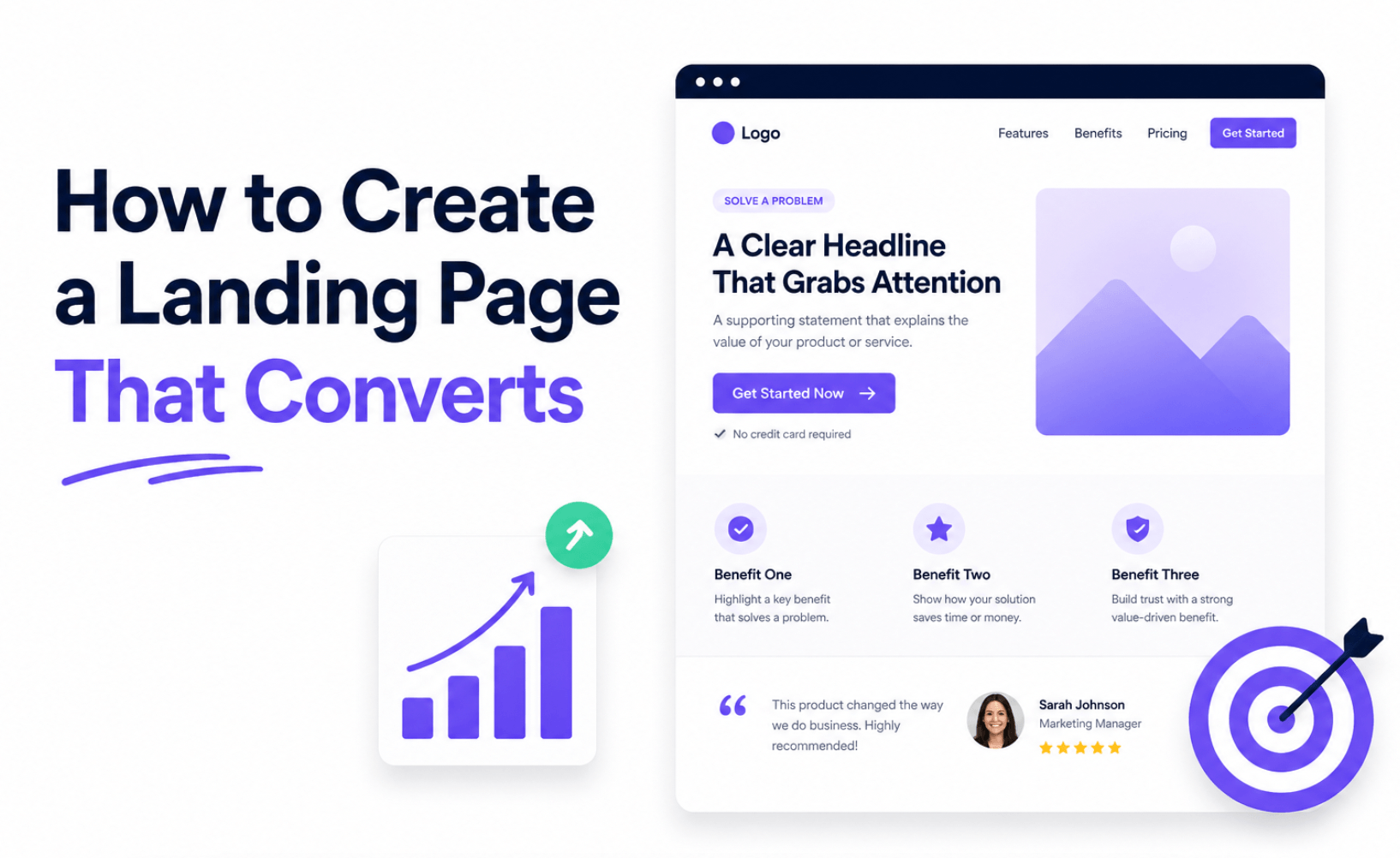
The Anatomy of a High-Converting Landing Page

Every effective landing page shares the same core structure. Mastering this structure is more important than using any particular tool or template.
A Clear, Benefit-Driven Headline
Your headline is the most important copy on the page. It has roughly three seconds to convince a visitor to keep reading. If it fails, nothing else matters.
A strong headline answers one question: What’s in it for me?
Weak headline: “Introducing the Expat Wealth Guide.”
Strong headline: “How to Build Real Wealth as an Expat Even If You’re Starting from Zero in a Foreign Country.“
The difference is clarity and specificity. The strong headline names the reader, names the outcome, and addresses a potential objection in the same breath.
Headline formulas that consistently convert:
- How to [desired result] Without [common obstacle]
- The [number]-Step System for [outcome] Even If [limiting belief]
- Finally: A [type of solution] That [specific result] Without [pain point]
Test your headline ruthlessly. A single word change can shift conversion rates by double digits.
A Supporting Subheadline
The subheadline expands on the promise of your headline without repeating it. Think of it as a one-sentence bridge between the hook and the body copy.
If your headline is the bold claim, your subheadline is the credibility statement or the elaboration that makes the claim believable.
Example:
Headline: Stop Leaving Money on the Table: Build a Wealth Plan That Works Across Borders
Subheadline: A step-by-step guide for expats and immigrants building long-term financial security in Latin America, written by someone who did it himself.
The subheadline introduces the author’s perspective and signals E-E-A-T (Experience, Expertise, Authoritativeness, Trustworthiness) without sounding boastful.
A Hero Image or Visual That Reinforces the Offer
Visuals communicate faster than words. The hero section, the area visible before a visitor scrolls, should include an image that reinforces what the visitor is getting.
For digital products, use.
- A clean mockup of your ebook, guide, or checklist
- A professional photo of yourself if the brand is personal
- A simple graphic that visualizes the transformation (before → after)
Avoid stock photos of generic “success” imagery; smiling businesspeople on laptops signal inauthenticity and erode trust faster than no image at all.
A Compelling Subheadline or Value Proposition Block
Below the hero section, introduce your offer with a short paragraph or a three-column value block that answers: Why this, why now, why from you?
This is where you explain the core benefit of your offer in plain language. Avoid jargon. Write like you’re explaining the product to a smart friend over coffee.
Example value block for a digital guide.
Save Years of Costly Mistakes
Learn the exact investment strategies, banking setups, and tax considerations expats need without spending years figuring it out the hard way.
Built for Life in Latin America
Not a generic finance guide. Every strategy is tailored to the realities of living, earning, and investing as a foreigner in Mexico, Colombia, or beyond.
From Someone Who’s Done It
Written by an engineer who moved abroad, built financial security from scratch, and documented the entire process.
Bullet Points That Sell the Outcome, Not the Feature
Bullets are one of the highest-converting page elements, but only when written correctly.
Most people write feature bullets.
- Includes 18 chapters
- Covers tax optimization
- PDF format
High-converting bullets sell outcomes.
- Discover the three bank accounts every expat needs to protect their money across borders and why most people get this completely wrong.
- The little-known tax treaty clause that can legally reduce what you owe in both your home country and your country of residence.
- A step-by-step investment checklist you can complete in a single weekend, even if you’ve never invested internationally before.
The format: [Outcome] [curiosity hook or pain point addressed]
Write 5–9 bullets. Any fewer and you haven’t made the case. Any more and you risk overwhelming the reader.
Social Proof
Social proof is the mechanism by which uncertain visitors borrow the confidence of people who’ve already bought or subscribed. It is not optional on a high-converting landing page.
Forms of social proof that work
- Testimonials: Written quotes from real users, ideally with a photo and name. Even two or three genuine testimonials outperform a page with none.
- Number-based proof: “Downloaded by 2,400+ expats across 14 countries” is more persuasive than any adjective you could write.
- Logos: If your work has been featured in any publication or platform, display those logos.
- Screenshots: For digital products or email lists, screenshots of real feedback (with permission) can be more credible than polished testimonials.
If you’re launching without any testimonials, offer your product to 5–10 people for free in exchange for honest feedback.
Never fabricate reviews. Real, specific testimonials, even imperfect ones, convert far better than polished but generic praise.
The Call to Action (CTA)
Your CTA is the moment of conversion. Everything on the page exists to make this click feel inevitable.
CTA best practices:
- Use one primary CTA per page. Multiple competing CTAs dilute attention and lower conversion rates.
- Write action-oriented, benefit-focused button copy. “Get the Free Guide” outperforms “Submit” every single time.
- Use contrast. Your CTA button should visually stand out from the rest of the page.
- Repeat the CTA. Place it above the fold, after your bullet points, and at the bottom of the page. Long pages can repeat it 3–4 times without being pushy.
High-converting CTA copy examples
- Yes, Send Me the Free Guide
- Get Instant Access →
- Start Building Wealth Abroad Today
- Download the Starter Kit. It’s Free
The word “free” in a CTA for a free offer consistently increases click-through rates. Use it when it’s accurate.
Address Objections Directly
Every visitor has objections. They’re wondering: Is this legit? Is it worth my time? Is this even for me?
An FAQ section or a short “This is for you if…” / “This is NOT for you if…” block handles objections proactively and builds trust by demonstrating self-awareness.
Example:
This guide is for you if:
- You’re an expat or immigrant living in Latin America (or planning to move)
- You want to build real, lasting wealth — not just survive paycheck to paycheck
- You’re ready to take your financial future seriously
This is NOT for you if:
- You’re looking for a get-rich-quick scheme
- You’re based in the US or Europe and don’t need strategies specific to LatAm
Counterintuitively, disqualifying the wrong reader builds confidence in the right reader. It signals honesty and specificity.
The Guarantee (If Applicable)
For paid products, a money-back guarantee removes the primary barrier to purchase: risk.
Even a simple 30-day “if you’re not satisfied, I’ll refund you” guarantee can lift conversion rates significantly.
State it clearly, keep it simple, and mean it. Refund requests on digital products are almost always lower than sellers fear.
A Clean, Distraction-Free Design
Design serves copy, not the other way around.
A high-converting landing page removes everything that could distract from the CTA.
- No navigation menu. Links out are conversion leaks.
- Minimal footer. Include only what’s legally required (privacy policy, terms).
- Ample white space. Dense text is harder to scan and signals low credibility.
- Mobile-first layout. More than half of landing page traffic arrives on mobile. If your page breaks on a phone, you are leaving conversions on the table.
- Fast load time. Every second of load delay reduces conversion rates. Compress images, minimize scripts, and use a reliable host.
Stick to two fonts, two or three brand colors, and a hierarchy that guides the eye from headline → value prop → CTA.
Landing Page Copywriting Tips That Make a Difference
Beyond structure, the voice of your copy determines whether a visitor feels understood or talked at.
Write to one person
Your ideal reader is a single individual, not a demographic category. The more specific you can be in describing that person and speaking directly to their situation, the more resonant your copy will be.
Lead with pain before you offer the solution
Empathy creates connection. Name the problem your reader is experiencing before you introduce your product as the answer.
Use “you” more than “we” or “I.”
Copy that centers the reader converts better than copy that centers the seller.
Short sentences. Short paragraphs
Online readers scan before they read. Make scanning easy and reward it by placing key benefits in prominent positions.
Specificity beats generality
“Save time” is weak. “Save 14 hours of research you’d spend piecing this together yourself” is persuasive.
Tools to Build Your Landing Page
You don’t need a developer or a big budget to build a high-converting landing page. Here are the most practical options depending on your setup.
For simplicity and speed.
- Carrd: Affordable, clean, and beginner-friendly. Ideal for single-page opt-in pages.
- Gumroad: Built-in landing and checkout pages for digital products, no extra tool needed.
For more control and customization:
- ConvertKit (Kit): Clean landing page builder integrated with email marketing.
- MailerLite: Solid landing page builder with email list integration included in the free plan.
For WordPress users
- Kadence Blocks or Elementor: Drag-and-drop page builders that give you full design control without custom code.
For most creators and solopreneurs building their first digital product, Gumroad + MailerLite is the fastest path from zero to a live, converting page.
How to Test and Improve Your Landing Page
Building the page is step one. Optimizing it is where the real gains are made.
Track these metrics
Conversion rate
The percentage of visitors who complete your CTA. A baseline conversion rate for a cold-traffic opt-in page is 20–30%. Paid traffic typically converts at 10–20%.
Bounce rate
Visitors who leave without any interaction. A high bounce rate signals a mismatch between your traffic source and your headline.
Time on page
If visitors leave in under 15 seconds, they’re not reading. Your above-the-fold section needs work.
What to test first
- The headline highest impact, easiest to change
- The CTA button copy
- The hero image
- The order of social proof elements
Run one test at a time. Change one element, measure for at least 100 visitors, then decide. Any less data than that and your conclusions will be misleading.
Common Landing Page Mistakes to Avoid
Even experienced marketers make these errors.
Too many CTAs
Pick one action you want the visitor to take. One.
Writing about features instead of benefits
Readers don’t care what your product contains. They care what their life looks like after using it.
No social proof
Especially on paid products, the absence of testimonials signals risk. Find a way to get even one or two genuine reviews before launch.
Ignoring mobile
Check your page on three different phone screen sizes before going live. What looks clean on a desktop often breaks badly on mobile.
Slow page load
Use tools like Google PageSpeed Insights to audit and fix performance issues. A page that takes more than 3 seconds to load loses a significant portion of visitors before they ever read a word.
Sending mismatched traffic
If your ad promises one thing and your landing page delivers something different, conversions will tank. The message and audience must align at every step.
Final Thoughts
A landing page that converts isn’t built on clever design tricks or expensive tools. It’s built on clarity about who you’re talking to, what problem you’re solving, and why your solution is the right one.
Start with the headline. Nail the one outcome your reader wants most. Build the rest of the page to make that outcome feel achievable and the decision to act feel obvious.
Then publish. Then test. Then improve.
The best landing page is not the one you spent the most time perfecting before launch — it’s the one you’re actively improving based on real visitor behavior.
Seki Hudson is an engineer and content creator based in Mexico, writing about building wealth, financial independence, and creating sustainable income as an expat. Follow along at sekihudson.com.