An email list is your most important asset as an online entrepreneur. People will tell you that the money is on the list, but very few people will tell you how to build one.
If you have a blog and you’re getting some traffic, you can easily turn it into a list-building machine by adding email option forms in some places on your blog.
In this post, I will tell you five places to put your email opt-in forms on your website to grow your list. I tested all of them, and they work.
Five Places to Put Email Opt-in Forms On Your Website to Grow Your List
There are five main places that I like to add email opt-in forms :
At the bottom of an article
I love putting my opt-in form at the bottom of my articles, and if you read this post until the end, you will find one (and please subscribe to get updates on new content).
If someone was on my website reading an article on how to make passive income online, I could add my signup box to the bottom of that article.
Ideally, I would relate it to the article the visitor has just finished reading. Most people who visit this blog want to make money online, become affiliate marketers, and build passive income, and I would offer them something in that line.
You don’t need to buy a new plugin for this, and I did it for free inside my ConverKit account.
Most autoresponders will allow you to add this type of form using their free WordPress integration.
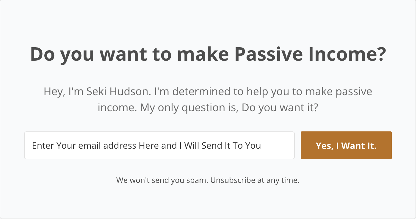
As a popover
This is where the signup form appears over the top of the page after the visitor has been on the page for a certain period or if the visitor is trying to leave your blog. You probably find them annoying daily, but they are extremely effective.
There are many paid plugins that can help you build this. I use the free version of Sumone to create those popovers, and it is very effective.
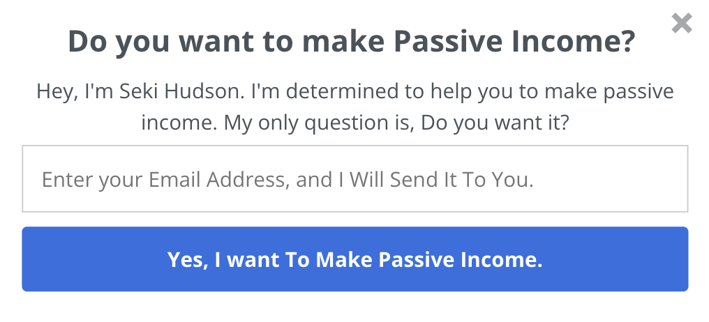
It has the same message as the opt-in form below the article. The only difference is that this one targets visitors trying to leave my blog or after they have been on it for a long time.
In the sidebar of my website
I don’t use this on my main website, but I do it in my niche blogs. I removed it here because I wanted to have only two opt-in pages, and it is less effective than the first two.
This is less effective because it tends to be outside the flow of where a visitor is looking, but it can be a good solution for some pages.
As a squeeze page
A squeeze page is a special page whose sole focus is getting someone to sign up. It could just be a signup form and nothing else.

This is the squeeze page I use to promote a free report that I give away. You can get it here.
I built my squeeze page using Thrive themes. You can get it here.
You can read my Thrive Themes review here.
Feature Box
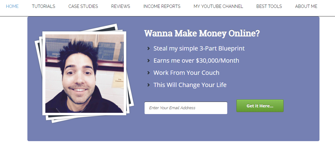
Your home page is among the best places for a prominent opt-in form. It’s the most visited page on your site, which means a well-designed form with a clear call to action can be very powerful for your business.
One of the most common ways to do this is through a feature box. A feature box is a full-width email opt-in form that focuses your reader’s attention on one clear call to action.
The best feature boxes offer the reader something, such as a toolkit, ebook, email course, or video series.
Everyone considering joining your list has many alternatives to your business… make sure to capture their interest by being valuable.
When I started this blog, I had one, but I had to remove it because I just wanted two places to subscribe: the popup box and after the post. This strategy works like a charm.
I learned this from Brendan Mace, who uses it in his blog, as you can see in the image below.
Final words
That is it; those are five places to put email opt-in forms on your website to grow your list.
Pick one, two, or three places to put your opt-in forms and start building your list. Just take action, and you will be fine.

